Time Series and Moving Average(MA)
In this tutorial, you will learn the following:
- What time-series is all about.
- The significance of time-series in data analysis
- Moving Average
- The various intervals of moving average - 2-point moving average, 3-point moving average etc.
- How to calculate moving average interactively
- Drawing a trend line based on moving averages
Time Series
If a variable changes with time, the data produces a time series on X-Y grid, with the variable along the y axis and the time along the x axis respectively.
E.g.
- • The number of after-shocks, after an earthquake in Japan for a certain period of days
- • The number of ice-cream sold by a small shop in the summer time
- • The number of goals scored by a football team in a season
- • The average daily temperature in winter time in a city in England
E.g.
The following graph shows two sets of time series, representing the sale of ice cream in a week by two small grocery shops owned by Mahesh Patel in Britain, hundreds of miles apart in two different regions.
Since the two cities are in Scotland and England, the daily temperature can vary significantly, even in summer. Based on the data we see, we can draw the following conclusions - a few among many:
- • The sale of ice-cream has been higher in the shop in Scotland for the specific week.
- • On day 3, Wednesday, the sales have been high in both cities, implying a high day temperature.
- • After Thursday, in Aberdeen, the sale has steadily dropped, implying a corresponding drop in temperature.
- • In Epsom, the sale has been fluctuating after Wednesday, implying a similar fluctuation in weather.
Similarly, we can draw a few casual conclusions from time-series plots - simply by observation. If you need a more scientific analysis, however, we need make a statistical approach - both for a reliable analysis and predictions.
Moving Average - MA
The moving average, also known as the rolling average or running average, provides us with a value to make more meaningful predictions from a time-series; it will be clearer to you before the end of this tutorial how moving average can smooth out a data cure, while giving a more accurate picture for forecasts/predictions. It takes into account a few successive data values and find an average, and then extends it to cover the whole time-series. It is done as follows:
You may have noticed that in order to find 3-point moving average, we select the first 3 data, then leaving the first one out, the next three and so on.
E.g.
1st 3-point moving average = (56 + 58 + 60)/3 = £ 58.00
2nd 3-point moving average = (58 + 60 + 59)/3 = £ 59.00
3rd 3-point moving average = (60 + 59 + 62 )/3 = £ 60.33
The 4-point moving average was calculated as follows:
E.g.
1st 4-point moving average = (56 + 58 + 60 + 59)/4 = £ 58.25
2nd 4-point moving average = (58 + 60 + 59 + 62)/4 = £ 59.75
3-Point Moving Average - interactive practice
Here is an opportunity for you to practise the moving average interactively. Just click the button to generate a new set of data and find out how 3-point moving averages are generated. It's the sale of DIY toolkits in a local DIY store for 6 consecutive weeks.
Please note how the moving average is plotted against the middle class of the three classes in question. You may have noticed that the curve of moving averages is much smoother than the original curve of data.
Finding Moving Average with Microsoft Excel
You can find the moving averages of a large dataset with Microsoft Excel. Excel gives you moving averages in a separate column and a graph - if selected as an option - showing both actual data and predicted values, the moving average data points.
In order to use Excel for moving averages, you need to make sure Data Analysis is part of Data tab. If not, please follow the steps below to get it:
- Click the File tab, then Options and finally click the Add-Ins category.
- In the Manage box, select Excel Add-ins and then click Go, next to it.
- You will now see the Add-Ins box. Check the Analysis ToolPak check box, and then click OK.
- Now, click the Data tab on the default Excel screen and you will see Data Analysis at the top right-hand end of the screen.
Once you get the Data Analysis on Excel, follow the steps below to find moving averages of a given dataset. In this tutorial, I focus on the simple dataset shown below.
E.g.
The enrolments of students on term-basis for two years, for a guitar club in a college are given below.
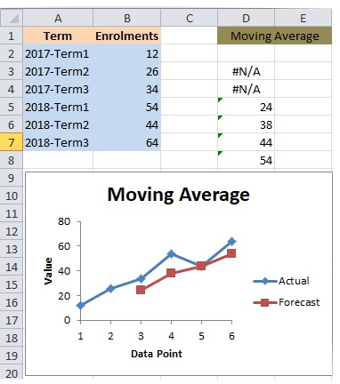
- Click Data tab, and then Data Analysis.
- Choose Moving Average.
- Choose Input Range - B2 to B7, in the above case.
- Choose Interval - 3 for 3-point moving average.
- Choose Output Range - a cell such as D3, in the above case.
- Choose Chart Output option - click the check box.
- Click OK.
You will get the moving averages along with a graph. The graphs shows the actual data and a forecast based on moving averages.
You must have noticed:
- • The forecast line is much more smoother than the line of the actual data, which in turn makes the reliable forecasts easier - thanks to moving averages.
- • Since the data is based on each term of a college year and there are three terms per year, 3-point moving average is used, in order to make the moving average more relevant for forecasting.
Now that you have read this tutorial, you will find the following tutorials very helpful too: